Beer Company Brand identity & packaging design




The brand
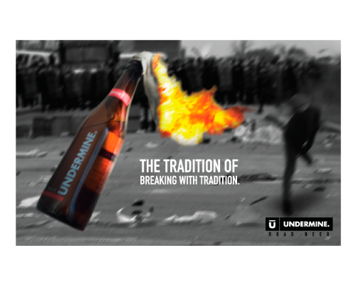
The name definition process for this new beer company was determined by the need to differentiate the brand in a market dominated by large breweries and full of thousands of microbreweries. The brand name Undermine Beer means a break with the brewing tradition. This company suggests that there is a different way of making beer and live the beer culture. So we finally found an edgy, bold name that leave clear that rupture with the establishment.
The logo
Our creative director , who is specialized in brand identity design was personally responsible of the creation of this new beer brand. The need to differentiate the brand from other companies in the market showed us a very clear path for the logo creation stage: the brand identity design needed to brake the rules. So the brand was built as a modern, bold and singular element that is perceived very differently from other distinctive brands in the industry (shields, old typogrphies, complex shapes, soft designs, etc.)


