Our creative branding team based the company name development stage in two concepts: the zen concept and the medical care. The result was a mix between the words zen and osteopathy. The name express calm and peace. It suggest that this clinic is a pleasant place that make patients feel relaxed and comfortable.
It is inspired in zen principles and nature concepts. This circle is a very strong shape that symbolizes the flow of energies in life. The green colour express equilibrium and peace. Our expert branding designers created a singular logo that define this clinic as a modern place where clients will find relax and comfort.
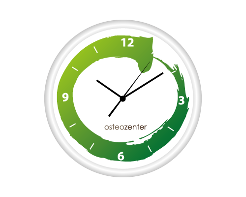
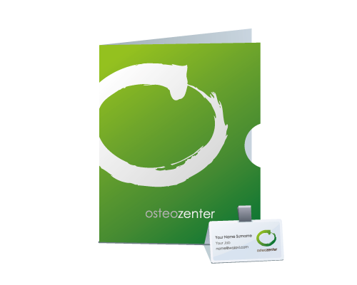
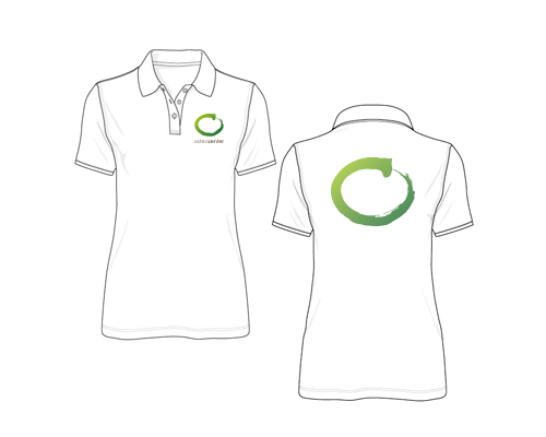
Our best corporate designers carried out a hard job with the corporate elements of this company. We designed all new signs, posters, stationery, uniforms... to create more than a brand identity, we wanted to create a full scenario that envolved clients in a zen environement.
The corporate design leitmotiv was nature and zen, we based our strategy in the geometry and repetition of the main logo to create a complete visual sistem that support the identity of the brand. All these detailed designs create a strong brand identity that keeps in the mind of the clients.