This movie soundtrac studio was founded by two expert guitar players, so our branding consultancy team decided to name their company as Fourhands Project, to represent the origins and the experimental way of work that they carry out. The name could be shorted into Fourhands, is easy to remember, and looks modern and trendy.
This creative logo design is based in the shapes of the four hands of the founders to compose an ecualizer that represent the spirit of the company. Our professional logo design team decided to use red and orange colours to represent the autum in Segovia. It is one of the most representative images of the place where this music producer is placed.
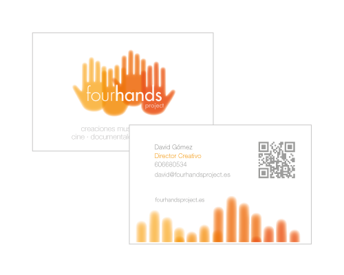
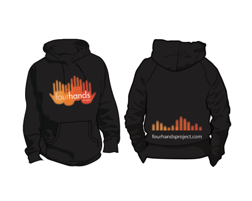
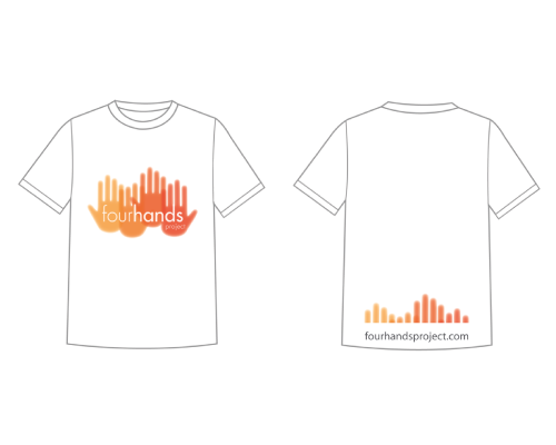
Our best brand identity designers created a wide range of corporate material that included stationery, sings, corporate brochures, labels, CD cover designs, posters, corporate interior design... All these corporate elements were carefully designed to keep the coherence and the strength of this new music brand.
All corporate material design is inspired in the shapes of the hands and the equalizer motif. Red and orange colours dedfine a warm atmosphere that envolves the clients into a conficence and pleasant ambient. Our corporate designers created a complete visual system for this music studio that turned it into a relevant and wel-known label.