Descriptive company names are a decisive factor in SEO (search engine optimization) and let us remember, you must be found. We created a clean logo based on two main words, ‘pharmacy’ and ‘buy’ for this online pharmacy. We kept it fresh and uncluttered, which coupled with pale blue and white maintains the healthy visual.
Colour has an important role to play in product management and marketing which is why we chose blue as the corporate colour. It expresses trust, efficiency, health and wellbeing. Our best logo designers cleverly, but simply, achieved a powerful and simple design. Standing out online is essential and we think you will agree we have achieved ‘memorable’.
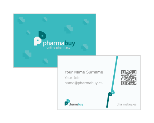
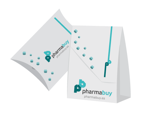
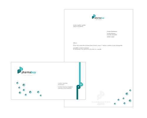
We know that as consumers we make a judgement about a product or service in a split second; sometimes we do not even get past seeing the logo before we move on. Unless the corporate design grabs our attention quickly customers will simply click on to the next. Being an online pharmacy our clients packaging and stationary range is vital so we really enjoyed working together to get it right.
Best brand identity designers help companies to create their brand on firm foundations. We consider the company personality, yes they all have one, and we look at their values, aspirations and customer base. Whether we are rebranding or starting from scratch, the coherence and respect for the brand identity is essential while developing corporate materials.