A great music band logo is more than just decoration; it’s a calling card and a piece of visual identity that can say as much about the music as the songs themselves. These influential music band logos, from bold, in-your-face graphics to subtle, mysterious symbols, become as iconic as the artists they represent. They’re stamped on album covers, plastered on T-shirts, and etched on devoted fans’ skin forever.
In this roundup, we’re exploring the designs that have stood the test of time, captured the spirit of entire genres, and transformed simple shapes and letters into pure rock ’n’ roll legend. These logos not only have visual appeal, but also act as powerful emotional triggers. They instantly transport fans to specific eras, concerts, and memories tied to the music. A single glance at a familiar emblem can evoke the raw energy of a live performance or the nostalgia of a favorite album.
1. The Rolling Stones logo
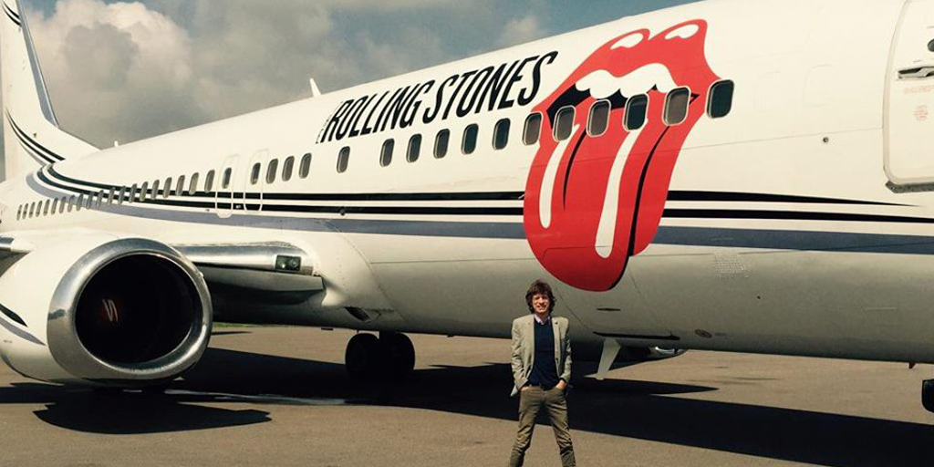
The Rolling Stones logo embodies pure rock ’n’ roll attitude. The famous red lips and tongue have been sticking out at the world since 1971. Designed by John Pasche and inspired by Mick Jagger’s pout and Hindu goddess iconography, the logo quickly took on a life of its own. Bold, cheeky, and slightly rebellious, it’s the perfect visual match for the Stones’ swagger and energy.
It’s amazing how it’s transcended the band to become one of the most influential music band logos on the planet. You’ll see it on everything from concert merchandise to street art to knockoff T-shirts in random markets. It’s not just a band emblem; it’s a universal symbol for rock music itself. Over 50 years later, that tongue is still wagging, and it doesn’t look like it’s going to stop anytime soon.
2. Nine Inch Nails logo
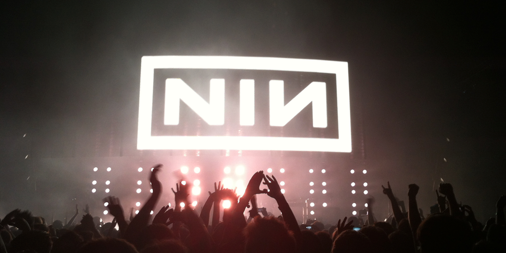
The Nine Inch Nails logo is a masterclass in minimalism. It’s simply the band’s name, “NINE INCH NAILS,” set in a bold, industrial-looking font and framed by a rectangle. The last “N” is flipped backwards. This subtle alteration gives the logo an unsettling, off-balance feel that matches the band’s dark, mechanical, and intense sound perfectly. Designed by Trent Reznor and graphic designer Gary Talpas in the late ’80s, the logo has barely changed in decades, which speaks to the strength of the design.
Its power lies partly in its versatility—it looks just as good huge on a concert backdrop as it does tiny on a CD spine. Clean, sharp, and instantly recognizable, it resembles a stamped metal plate you’d find in a dystopian factory. The design’s simplicity is so effective that it has popped up in unexpected places. Most notably, a slightly altered version was used in a Canadian political campaign in 2015, causing many to do a double take. Just like Nine Inch Nails’ music, the design is sleek on the surface but loaded with tension underneath.
3. Red Hot Chili Peppers logo
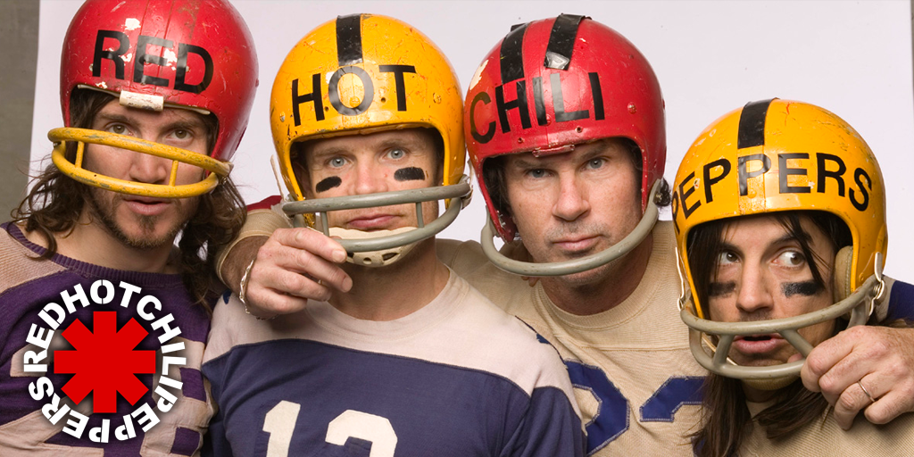
The Red Hot Chili Peppers’ logo is as bold and instantly recognizable as the band itself. At its core is a large red asterisk, officially called the “Star of Affinity”, with the band’s name written in all caps around it. This music band logo is simple yet striking, and it has been part of the band’s identity since the early ’80s. Its clean, circular design is versatile enough to be used anywhere: on an album cover, a drumhead, or the front of a faded tour T-shirt.
It matches the band’s playful, slightly chaotic, and unmistakable personality, which is great. Although it may seem like a calculated design by a brand consultant, it’s actually pure, unleashed rebel energy. The asterisk doesn’t have one set meaning. Anthony Kiedis has joked that it’s just a random doodle, but that’s kind of the point. It’s open to interpretation, much like the band’s mix of funk, punk, and rock. Decades later, it’s still one of the most iconic symbols in music, instantly evoking California sunshine and wild, high-energy shows.
4. Led Zeppelin
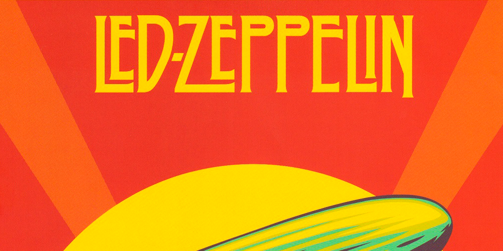
The Led Zeppelin logo is a rock legend in its own right. Usually, it’s the band’s name in a tall, Art Deco–style typeface. The stretched, elegant letters with sharp lines make the logo feel classy and powerful. While not flashy or overly complex, it has a timeless quality—much like the band’s music. You’ll see it on their albums and merchandise, most famously alongside the four symbols that each band member chose for Led Zeppelin IV.
Part of its allure lies in how it balances mystery and confidence. It feels iconic without trying too hard and fits right in with the band’s mix of bluesy grit, mystical lyrics, and thunderous rock. Whether printed large on a stage backdrop or small on a record spine, the name carries that unmistakable Zeppelin energy: epic, enduring, and slightly mythical.
5. Nirvana logo
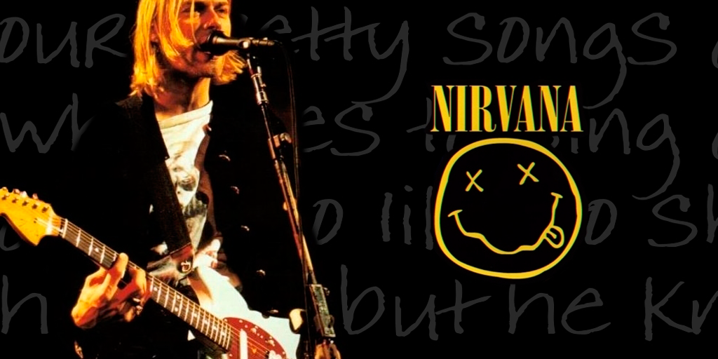
The Nirvana smiley face logo is one of those images that just screams “the ’90s.” It’s a sloppy, hand-drawn, yellow smiley face with crossed-out eyes and a goofy, crooked grin. It looks kind of drunk and dazed. The band’s name sits above it in a bold, clean typeface that makes the messy face underneath stand out even more. You can find it plastered on T-shirts, hoodies, and posters all over the world, even on people who might not be able to name a single Nirvana song.
Its memorability stems from how perfectly it fits the band’s vibe: raw, slightly sarcastic, and not trying too hard to be “perfect.” It’s got that grunge-era mix of irony and rebellion—like a middle finger wrapped in a smile. Over the years, the design hasn’t lost any of its edge. Whether you see it at a rock show or on a thrift-store T-shirt, it still feels like a piece of counterculture.
6. Kiss logo
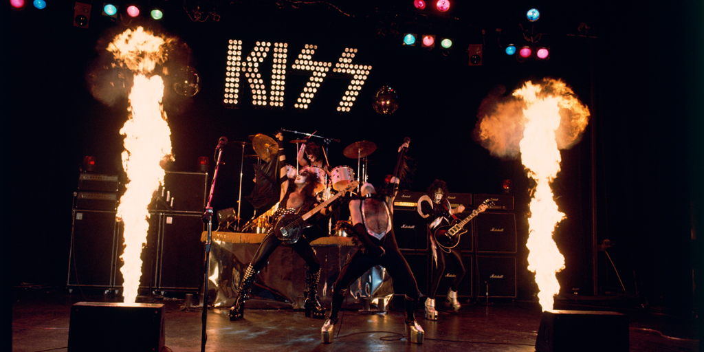
The KISS influential music branding embodies pure rock ’n’ roll attitude. Those bold, blocky letters and lightning bolt–style “S” shapes have been blasting from stages, T-shirts, and album covers since the early ’70s. It’s loud, in-your-face, and impossible to mistake for anything else—a perfect match for the band’s over-the-top shows and wild persona. Even if you’ve never heard a KISS song, you’ve probably seen the logo in pop culture.
Its iconic status stems from its simple yet aggressive appearance. There’s nothing soft about its sharp angles and hard lines. It’s clear that it’s not a corporate brand identity design; it seems destined to be loved by people around the globe. Over the years, it has barely changed, which speaks to its staying power. Like KISS themselves, it’s unapologetic, larger than life, and designed to grab your attention at first glance.
7. Foo Fighters logo
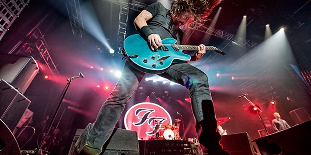
The Foo Fighters logo is one of those instantly recognizable rock band symbols, even for non-fans. At the center are two bold “F” letters facing each other inside a clean circle. The logo is simple and stylish with a retro feel that matches the band’s love for classic rock. You’ve probably seen the logo on everything from album covers to drum kits to the front of Dave Grohl’s amps. It fits the band’s no-frills, straightforward personality perfectly.
The logo’s coolest feature is that it doesn’t scream for attention. It’s not overly flashy or complicated, yet it has a timeless quality. Whether it’s in bright red or stripped down to black and white, it carries the same punch. Like the Foo Fighters themselves, it’s reliable, powerful, and built to last. It’s the kind of emblem you could put on a T-shirt and wear for decades without it ever feeling outdated.
8. Muse logo
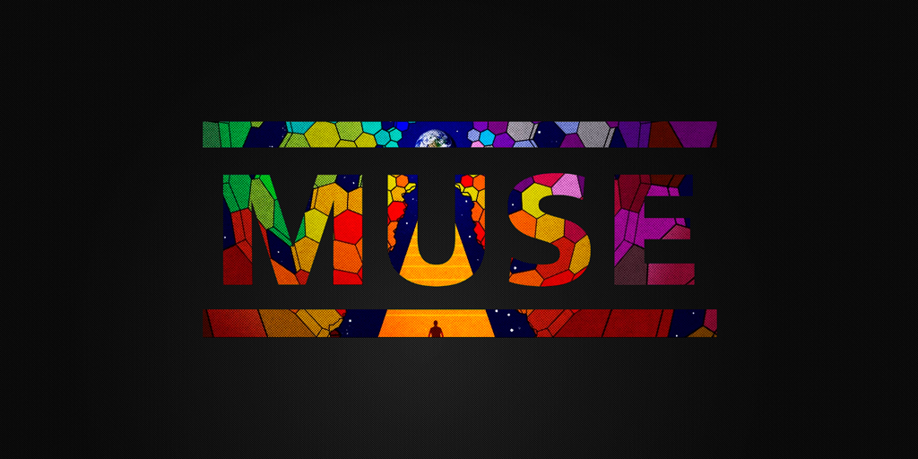
The Muse logo is clean, sharp, and modern, much like the band’s music. It’s typically just the word “MUSE” in bold, blocky letters, with a horizontal line above and below it, as if it’s framed. This simple design gives the logo a sleek, futuristic vibe, which is perfect for a band that blends rock with electronic and cinematic sounds. The logo looks just as good on a massive LED stage backdrop as it does on an album cover or T-shirt.
What’s cool about it is how timeless it feels. Even though Muse’s music often pushes into experimental territory, their logo stays minimal and iconic. It’s instantly recognizable and leaves plenty of room for wild visuals—lasers, video screens, pyrotechnics, etc. Like the band, it exudes confidence, saying, “We don’t need to overcomplicate this. You’ll remember it.”
9. The Doors logo
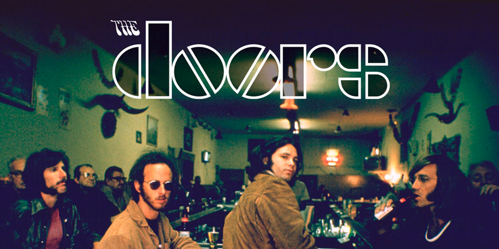
The Doors’ typography is a classic of the late ’60s rock scene. With its chunky, geometric letters and oversized “O,” it immediately stood out and became one of the most influential band logos of the 60s. Its vintage, psychedelic-era design screams the time period. Its sharp, blocky style gives it a bold, almost architectural feel, yet it retains a bit of the band’s signature trippy, counterculture energy. One could imagine it painted on a club wall in 1968 or printed large on a concert poster.
What’s great about it is that it never went out of style. Whether on an old vinyl sleeve or a brand-new T-shirt, it still looks cool and mysterious—just like The Doors themselves. The logo captures the band’s mix of poetry, rebellion, and rock ‘n’ roll swagger, making it one of the most memorable logos of all time.
10. Kasabian
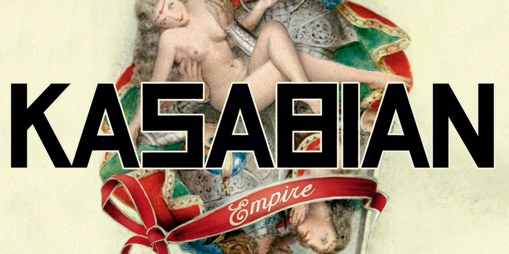
The Kasabian logo has a blocky, angular look that resembles Cyrillic lettering. Much like the band’s punchy, no-nonsense rock sound, the Kasabian logo is bold and stripped down. It’s typically just the band’s name in all caps, set in a thick, blocky font that feels strong and direct. There are no flashy icons or extra decorations—just straightforward typography that commands attention. The creative design perfectly complement Kasabian’s high-energy, confident vibe, allowing the music and visuals to take center stage.
Over the years, they’ve experimented with different versions, sometimes cleaner and sometimes with a slightly rougher edge, but it’s always maintained that same stark, powerful presence. It’s the kind of logo you can put on a poster, record sleeve, or festival banner and instantly recognize: a band that’s here to make noise and take over the stage.
