Posts Categorized: colours and design

Why Luxury Brands Love Black: Fashion’s Most Iconic Color

black luxury brand designer

Black is more than just a color—it’s a universal symbol of luxury. From haute couture and fine jewelry to high-performance cars and watches, luxury brands love black. It is the ultimate visual shorthand for elegance, exclusivity, and status across industries. Step into a luxury boutique, and you’ll find it in the walls, shopping bags, ribbons,… Read more »

The Alchemy of Color in Logo Design: The Ultimate Guide

brand identity designers mortimerland colours logo design

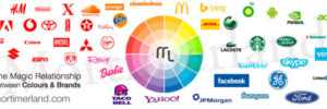
The colors used in brands and logos send clear signals that we can accurately interpret. Brand identity designers understand how colors impact people’s minds and know how to use them as powerful marketing tools. The power of color in logo design is easy to underestimate because primitive instincts are largely unconscious. Yet, we buy a box of cornflakes or a cold drink every day for unconscious reasons.

How to Master the Color Blue in Brand Design: Identity Secrets

Blue color in brand desing

Blue is the color of trust, loyalty, and honesty. So it’s no surprise that great branding designers know how to harness its psychological power. Blue is calm and steady, avoids pressure and stress, and prefers to operate in its own way. It also conveys reliability and responsibility. Many creative agencies strategically use blue color in brand design for these very reasons. Countless companies have chosen blue as their corporate color because it inspires trust. Every company wants to communicate truth, order, and honesty to its audience.

The Astonishing Power of Orange Color in Marketing

brand identity designers mortimerland colours orange

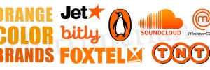
Orange is a color that refuses to be ignored, and marketing professionals understand its magnetic pull. Bold, energetic, and instantly eye-catching, orange is a popular choice for companies that want to stand out in a competitive market. Beyond its visual impact, orange carries deep psychological associations. It evokes warmth, sociability, and approachability, making people feel welcome and at ease. Many brands use orange to trigger feelings of comfort, from cozy interiors to delicious meals, thereby tapping into our natural desire for physical and emotional satisfaction.

Why Experts Love Yellow for Brand Identity Design

best branding consultants design yellow 1

Yellow is impossible to ignore. It’s bright, energetic, and full of personality—perfect for making a brand stand out in a crowded market. In brand identity design, yellow adds more than just color; it adds attitude, grabs attention, and sticks in people’s minds. Whether it’s a logo, packaging, or marketing materials, a touch of yellow can make a brand instantly recognizable and give it a unique, unforgettable presence.

Why Designers Love Pink Branding for Perfume Brands

corporate logo designers pink brand 1

Pink steals the spotlight in perfume design, capturing attention with its playful charm and chic elegance. From delicate pastels to bold fuchsias, pink adds personality, energy, and a touch of whimsy, making every fragrance instantly memorable. Pink branding can be soft and romantic or bold and confident, adapting to the story of the scent. Pink… Read more »

The Powerful Effect of Green Branding on Eco Trends

Effect of Green Branding on Eco Trends

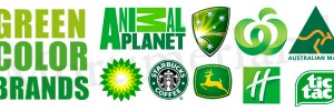
Green isn’t just a color—it’s a versatile branding tool that can communicate growth, sustainability, and positivity all at once. In eco-friendly and purpose-driven branding, green brand identity often acts as the “joker,” bringing energy, creativity, and an unexpected twist to a brand’s visual identity. From startups promoting sustainability to luxury brands emphasizing environmental responsibility, green can make a logo or brand identity feel fresh, authentic, and instantly recognizable.