The colours of the brands and logos send out clear signals that we can all read accurately. Professional brand identity designers know very well the way colours affect people and how to use them as a powerful marketing weapon. In today’s sophisticated world it is easy to underestimate the power of primitive instincts, as they are largely unconscious. Today we might be contemplating a packet of corn flakes or a new cold cure, rather than a primitive meal or a curative herb, but exactly the same instincts come powerfully into play. The colours of the interior environment wherein we live or work affect us in just the same way as those in the natural world always did.
Red
Red brands express strength, energy, stimulation and passion. Red colour is the king of the brand identity design colours. And it’s because of its property of atractting our attention first. Its effect is physical; it stimulates us and raises the pulse rate, giving the impression that time is passing faster than it is. It is stimulating and lively, very friendly. However, at the same time, it can be perceived as demanding and aggressive.
Blue
Blue brands are related to intelligence, trust, efficiency, communication, and calm. Brand identity designers know perfectly that blue is the colour of the mind and is essentially soothing; it affects us mentally, rather than the physical reaction we have to red. Strong blues will stimulate clear thought and lighter, soft blues will calm the mind and aid concentration. Consequently it is serene and mentally calming. It is the colour of clear communication.
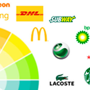
Yellow
Yellow brands mean confidence, optimism, extraversion, friendliness and creativity. Yellow is the strongest colour, psychologically. The right yellow will lift our spirits and our self-esteem; it is the colour of confidence and optimism.
Green
Green brands express intelligence, harmony, refreshment, environmental awareness, equilibrium and peace. Green strikes the eye in such a way as to require no adjustment whatever and is, therefore, restful. Being in the centre of the spectrum, it is the colour of balance; a more important concept than many people realise. Nevertheless, it can also be related to stagnation and, incorrectly used, will be perceived as being too bland.
Orange
Orange brands are related to physical comfort, security, sensuality, abundance and fun. Theese brands focuses our minds on issues of physical comfort: food, warmth, shelter… And ovbiously it is a fun colour. Equally, too much orange could mean frivolity and a lack of serious intellectual values.
Pink
Pink brands mean warmth, femininity, love and sexuality. Being a tint of red, pink also affects us physically, but it soothes, rather than stimulates. Pink is a powerful colour, psychologically. It represents the feminine principle, and survival of the species; it is nurturing and physically soothing. Too much pink is physically draining and can be somewhat emasculating.
Black
Black brand identity logos are usually related to glamour, sophistication, security, efficiency, and substance. Black creates protective barriers, as it absorbs all the energy coming towards you, and it enshrouds the personality. It communicates absolute clarity, with no fine nuances. It communicates sophistication and uncompromising excellence and it works particularly well with white. Black creates a perception of weight and seriousness.