
Green isn’t just a color—it’s a versatile branding tool that can communicate growth, sustainability, and positivity all at once. In eco-friendly and purpose-driven branding, green often acts as the “joker,” bringing energy, creativity, and an unexpected twist to a brand’s visual identity. From startups promoting sustainability to luxury brands emphasizing environmental responsibility, green can make a logo or brand identity feel fresh, authentic, and instantly recognizable.
Standing Out in a Sea of Green: How to Make Eco-Branding Truly Original
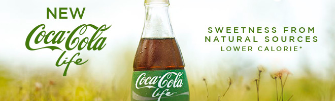
Current eco-trends have sparked a “green fever” in branding design, making it difficult to distinguish between organic and eco-friendly brands. Since green is instinctively associated with nature, using it in branding seems like a no-brainer. However, when everyone relies on the same shades, patterns, and motifs, the psychological advantage of green fades, and brands risk blending into a crowded market.
Originality and uniqueness are now the real currency in green, ecological branding design. To stand out, a brand must go beyond obvious green tones and nature-inspired graphics and find unique ways to communicate its values and story. This can be achieved through innovative design, unexpected color pairings, or distinctive messaging. Creating a memorable green brand requires creative thinking while staying true to an eco-conscious ethos.
For example, an eco-friendly boutique brand could design a logo that combines muted, earthy greens with handcrafted typography and minimalist packaging. This design would communicate sustainability and sophistication. Rather than relying on the typical leaf or tree icons, the brand could use abstract patterns inspired by natural textures to create a distinctive look that stands out in a crowded market. This approach would reinforce the brand’s ecological values and position it as original, memorable, and appealing to discerning, environmentally conscious customers.
Dark green: A color for luxury and high-end markets
Dark green has long been associated with quality, sophistication, and timeless elegance, making it a perfect choice for premium brands. In high-end branding, this shade conveys stability, exclusivity, and refined taste, setting products and services apart from their mass-market competitors. Unlike brighter greens, which are tied to nature and eco-conscious messaging, dark green communicates seriousness and prestige. It instantly signals to customers that they are engaging with something exceptional.
For instance, a luxury restaurant branding creation could incorporate dark green into its logo, menus, and website to highlight elegance and culinary excellence. When combined with subtle gold accents or classic typography, this approach reinforces the brand’s premium positioning and ensures a memorable, distinct identity. When used thoughtfully, dark green becomes a symbol of trust, sophistication, and high-end appeal, not just a color.
More than a color, a universe of sensations in neuromarketing
Green isn’t just visually appealing; it triggers the brain’s instinctive responses. Neuroscience shows that colors like green can evoke calm, balance, and positive emotions almost immediately. This makes green a powerful tool in neuromarketing. When brands use green strategically, they’re creating a subtle emotional connection that can influence customer perception and behavior, not just choosing a color.
From eco-conscious startups to luxury brands, green helps create a sensory universe that conveys values and personality. The right shade of green can evoke feelings of trust, growth, and exclusivity, whether it’s a simple logo, mass-market packaging, or a high-end website design. In neuromarketing, green is more than just a design choice; it’s a strategic tool that helps brands engage, persuade, and retain their audience.