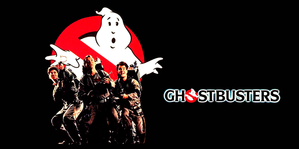
Although some of these movies are true masterpieces this article is nothing to do with screenplays, directors, scenes, etc. Today we are going to talk about the most famous movie logo designs of all time. People are used to focusing their attention on movie characters, special effects and impressive scenarios, however, the highly creative job of some great brand designers also has had a big influence on the huge success of these cult movies.
1. Ghostbusters
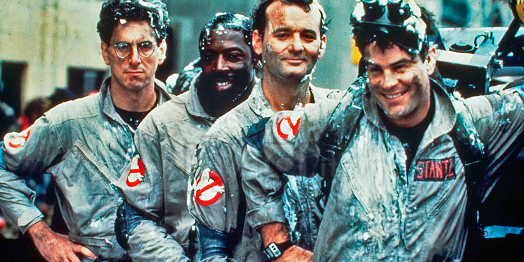
No matter how old are you or where you come from. Wherever you see this logo you will recognize it at first sight. Not only this brand identity design is universal but also it is fun, attractive and effective. The nuance of 80s style is undeniable, however, this is one of the best examples of timeless movie logo designs. It is remarkable that Ghostbusters logo and a their company never existed in real life whereas there are thousands of real companies still struggling with finding a succesful brand identity design for their real business.
2. The Godfather
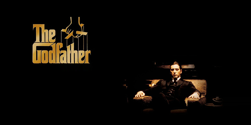
Who doesn’t know this symbol of power and respect. Designed by S. Neil Fujita, it is one of the most famous typographies of all time, nevertheless, this brand identity design is much more than its typography. The hand that pulls strings says everything about the power relations that take place in this masterpiece. It is easy to notice when a logo becomes a symbol of popular culture, and that’s exactly what happened to this beautiful graphic design creation. T-shirts, posters, mugs, etc are the most obvious evidence of its fame.
3. James Bond 007
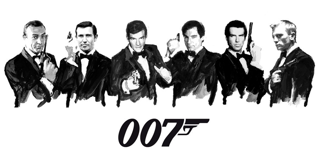
The 007 gun symbol is synonym of action and elegance everywhere. It has such a singular shape that is impossible to forget it. Of course it is one of our favorite movie logo designs of all time. The way they use the number 7 to create the silhouette of a gun is really clever and defines this logo as one of the most singular brand identity designs in the world.
4. V for Vendetta
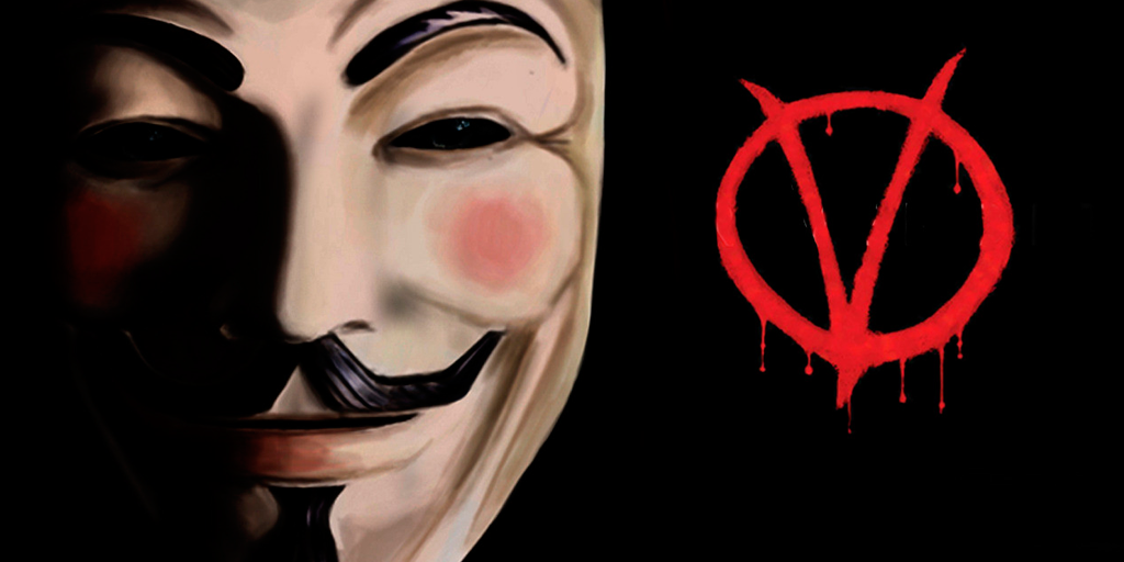
The V logo is one of the most famous symbols of anger and revenge. The red color helps to make it even more powerful and passionate. You can feel the rage burning inside it. It really works. As everybody knows, all the symbolism of this movie turned into the universal symbolism of protest against the system.
5. Superman
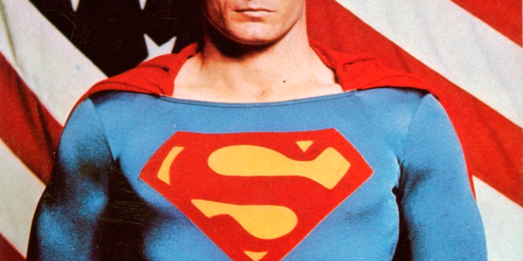
It is probably the most famous “S” in history of logo designs. Besides the movies, the “Superman S” has become a real brand. Lots of fashion clothing companies had bought the rights of this logo to develop some of their collections. This “S” let people dream, turn them into something special… “we can be heroes just for one day”. You can learn a bit mor about superman logo evolution here: superman logo evolution.
6. Jurassic Park
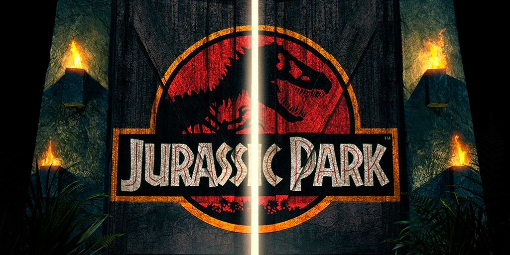
This fossilized tyrannosaurus rex silhouette placed inside the red circle really makes me scare. In matter of design, it works particularly well because you can’t take your eyes off of it. However, it also tells you a little story. This movie logo design is telling you about this fascinating island of dinosaurs but it also warns you about the danger hidden behind it. Regarding Jurassic Park typography it has been one of the most plagiarized ones after its premiere in 1993. And what about business… Jurassic Park design is a true gold mine.
7. The Warriors
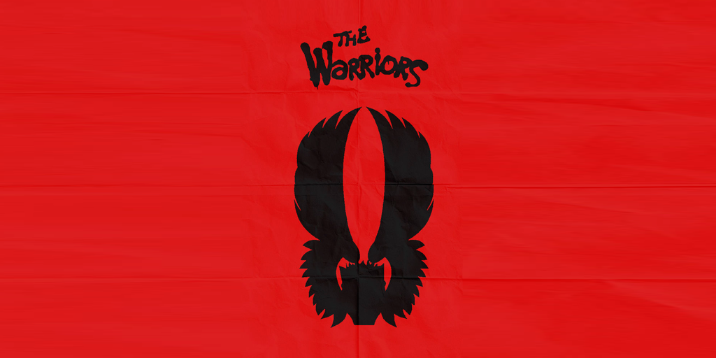
The Warriors brand identity is really full of energy. It is a mixture of rage, youth, rebellion and power. Red colour makes it even more intense and the skulls and the wings contribute to its singularity. However, it is the graffiti typography what really makes a difference in this priceless logo.
8. The Goonies
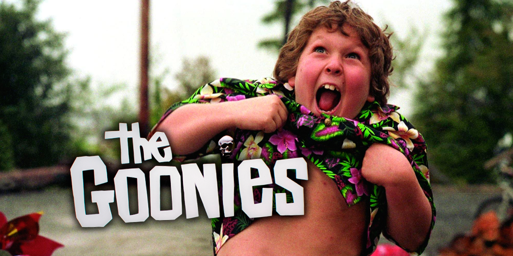
This is another great example of how typography can define an iconic brand identity and make it stand out. The Goonies logo is the symbol that every child crew would have. It’s a symbol that would make you proud to belong to that group. And if you also add a skull to it you have a winner.
9. The Mighty Ducks
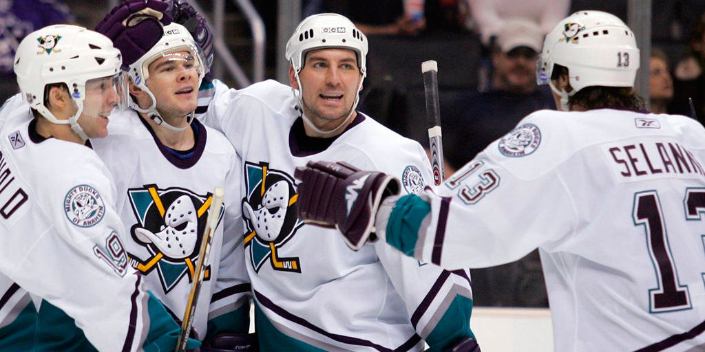
I’m aware of it is not the most popular movie of all time. But as I said in the intro, we are here to talk about logos, not about the quality of the movies. And I’m absolutely sure that you have recognized this logo at first sight, so it doesn’t seem a bad brand. Regarding it features it has a really singular shape, it is fun and powerful at the same time. Just forget about the movie guys, this logo deserved to be on this list.
10. Snatch
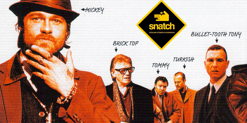
The Snatch logo is probably the less known one of this ranking. Don’t be so strict, just think that it must be really difficult to steal Brad Pitt’s prominence in the cover. Nevertheless, I find this movie logo design particularly interesting. The way they use the hand to resume the story of the movie is really clever and the whole logo works really well as a symbol.
