Let’s explore the greatest movie logo designs and the visionary artistry behind them. These designs have become iconic symbols of film history. These logos, ranging from unforgettable franchise designs to striking one-offs, do more than just look good. They set the mood, spark excitement, and stick in your mind long after the credits roll. Learning how they were created offers a fascinating glimpse into the creativity and skill behind some of cinema’s most memorable visuals.
These logos are more than just titles on a poster—they’re the visual heartbeat of the film’s identity. From the bold typography of classic action franchises to the whimsical lettering of beloved family films, each design captures the tone, genre, and atmosphere before a single scene even plays. They set expectations, spark curiosity, and in many cases, become just as recognizable as the characters or iconic lines from the movie itself. These symbols are not just fake brands created for movies; they have transcended the screen and become real brands that generate millions of dollars. This subtle yet powerful branding is crucial to why certain films remain etched in popular culture for decades.
1. Ghostbusters logo
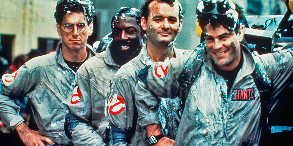
The famous Ghostbusters logo, with its cheeky white ghost trapped inside a bright red “no” symbol, is almost as legendary as the movie itself. The logo was designed by Michael C. Gross, the film’s associate producer and a well-known art director with a talent for creating memorable graphics. Gross wanted to create something that would instantly convey, “Yeah, we catch ghosts,” without a single line of dialogue. His idea was simple yet genius: combine a classic prohibition sign with a silly, cartoonish ghost to create a visual joke that transcends language barriers.
What’s really fun is how the logo became part of the film’s story. It’s not just a marketing image; it’s displayed on the Ghostbusters’ gear, car, and headquarters, giving it the feel of a real-world brand within the movie’s universe. Over the years, the design has barely changed, which speaks to its strength. It’s bright, bold, and has personality. It’s no wonder that it’s one of the most recognizable movie logos in history, right up there with Superman and Jurassic Park.
2. The Godfather logo
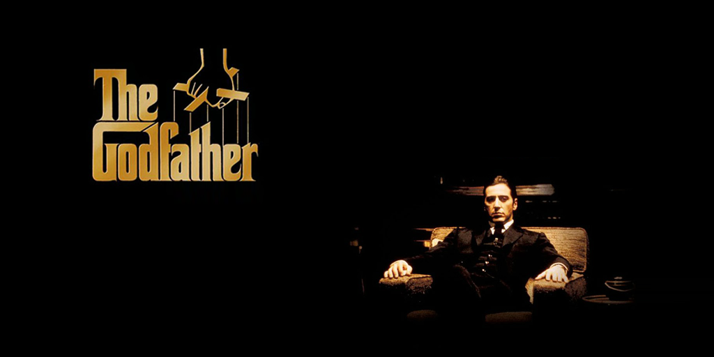
The Godfather logo is a masterclass in simplicity, offering a subtle nod to the story. Designed by S. Neil Fujita—a graphic design legend known for his bold book covers and movie artwork—the logo features a clean serif typeface and unmistakable puppet strings hanging from the “G.” The strings aren’t just decoration; they’re a nod to the mafia’s grip on the film’s world, pulling the strings behind the scenes like a puppet master. Fujita first created the logo for the cover of Mario Puzo’s novel in 1969. It was so perfect that, when the film was released in 1972, the logo remained unchanged.
The logo’s magic lies in its timelessness. It embodies high-end branding that reflects La Famiglia’s status. There are no flashy colors or over-the-top effects, just pure luxury black and white exuding quiet authority. The logo radiates pure class and exclusivity. It’s so iconic and versatile that it could be the branding of a luxury restaurant or a high-end lounge bar. This top-tier brand identity looks as good on a VHS tape from the ’80s as it does on a 4K Blu-ray today. Over the decades, the logo has become inseparable from the film’s legacy, instantly conjuring images of Brando’s Don Corleone, dimly lit rooms, and the slow, inevitable unraveling of loyalty and family. In the crowded world of movie logos, this one doesn’t shout; it whispers—and somehow, that’s even more powerful.
3. James Bond 007 logo
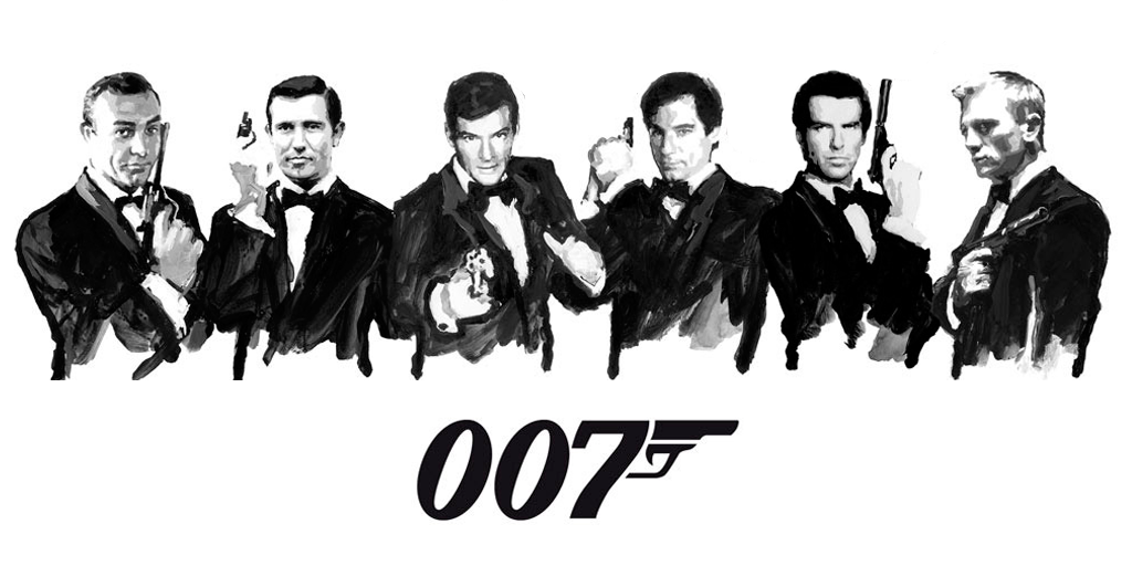
The James Bond 007 logo is as sleek as the secret agent himself. First introduced in 1962 for Dr. No, the logo was designed by Joseph Caroff, an American graphic designer with a talent for memorable branding. The sleek “007” is instantly recognizable thanks to the clever twist where the “7” transforms into a gun — because what is Bond without his trusty Walther PPK? The design captured the franchise’s essence from the beginning: classy, dangerous, and effortlessly cool. Over the decades, the typeface has undergone a few modern touch-ups, but the core gun-barrel concept has remained unchanged, proving that perfection shouldn’t be tampered with.
The beauty of the 007 logo is its flexibility. It can be gold for sophistication, silver for high-tech spy vibes, or black for pure stealth. No matter the color, when you see it, you instantly think of fast cars, exotic locations, and the iconic opening sequence where Bond turns, aims, and fires. The logo is more than just a movie symbol; it’s a global icon of action, intrigue, and shaken-not-stirred style. Honestly, if cool could be distilled into a graphic, this would be it.
4. V for Vendetta logo
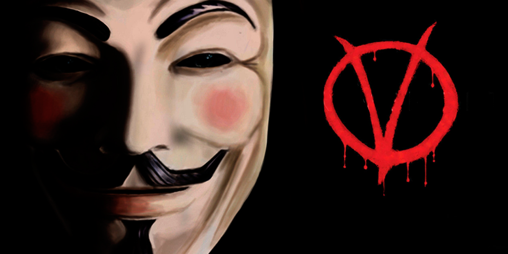
The V for Vendetta logo is as striking and rebellious as the story itself. Designed to match the graphic novel’s edgy aesthetic, the logo features a bold, jagged “V” enclosed in a circle. It is simple yet instantly recognizable and packed with symbolism. The circle-V motif evokes revolution and defiance, mirroring V’s anarchist mission in the film. While David Lloyd, the illustrator of the comic series, designed the original logo, the movie version polished it into a sleek, cinematic emblem that stands out on posters, masks, and merchandise. It’s the kind of logo that immediately signals danger, mystery, and a fight against oppression.
This logo is memorable because of its connection to the iconic Guy Fawkes mask. The “V” logo often appears with the mask, which reinforces themes of rebellion and identity. Its simplicity makes it absolutely versatile. It would work equally well as a movie logo or as one of the best music logos ever. Whether projected as graffiti on London streets in the film or emblazoned on T-shirts and banners at real-world protests, it carries the same punch. This logo doesn’t just represent a movie; it’s become a cultural symbol of resistance, blending design, storytelling, and social impact.
5. Superman logo
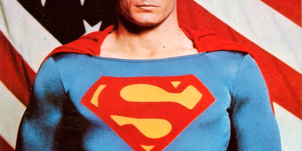
The Superman logo is one of the most iconic symbols in pop culture, and it’s easy to see why. Originally designed by Joe Shuster, one of Superman’s co-creators, the bold red “S” inside a diamond-shaped shield first appeared in Action Comics #1 in 1938. Shuster wanted a symbol that screamed heroism and hope — something that would be instantly recognizable, even from a distance. Over the decades, the design has evolved with minor tweaks, but the core “S” shield has remained remarkably consistent, proving that some logos are too powerful to change.
The Superman logo’s versatility and emotional impact are what make it so timeless. Whether it’s on comic book covers, movie posters, or fans’ T-shirts, the shield instantly evokes courage and justice and the idea that anyone can be a hero. It’s not just a logo; it’s a symbol of hope. Seeing it on screen or in print triggers instant nostalgia for generations of fans. From comics to blockbuster films, this emblem has soared alongside Superman, cementing its place as one of the greatest movie and comic logos of all time.
6. Jurassic Park logo
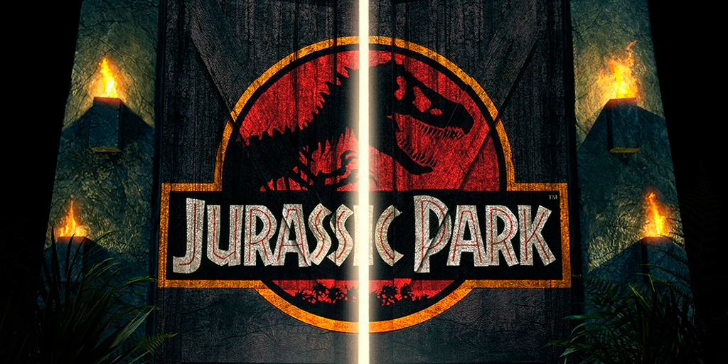
The Jurassic Park logo is instantly recognizable: a fierce T. rex skeleton silhouetted against a red and black circle with bold lettering that screams adventure. Legendary graphic designer and art director Chip Kidd designed it, wanting a logo that was simple, iconic, and perfectly captured the thrill of the movie. The design brilliantly conveys danger, excitement, and prehistoric awe, making it impossible to ignore. Even without seeing a single frame of the film, the logo tells you exactly what kind of wild ride you’re in for.
What makes this logo legendary is how it has stood the test of time. From merchandise and toys to posters and video games, the T. rex emblem is everywhere and instantly recognizable to fans of all ages. Its bold, minimalist design makes it highly adaptable, and the combination of striking colors and dynamic imagery makes it pop in any medium. It has become more than just a movie logo; it has become a symbol of adventure, dinosaurs, and the groundbreaking spectacle that Jurassic Park brought to the big screen. This makes it one of the most iconic movie logos in history.
7. The Warriors logo
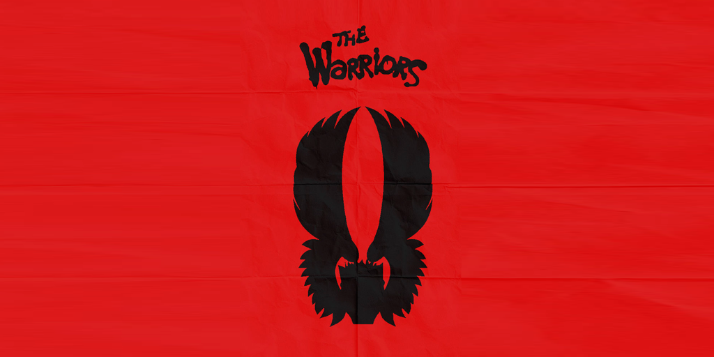
The Warriors logo embodies the gritty essence of 1970s New York—it’s raw, loud, and impossible to miss. It was designed to look like it was spray-painted on a brick wall. The bright red, graffiti-style lettering matches the movie’s street-gang vibe perfectly. Although the exact designer isn’t widely known, the logo’s style was heavily influenced by the urban art scene of the era, blending punk rebellion with a dangerous, underground energy. The logo isn’t polished or corporate; it’s meant to feel messy and rebellious, straight from the back alleys of Coney Island, where the story begins.
The logo’s lasting appeal stems from how it became an emblem for the movie’s cult following. Fans proudly wear it on jackets, T-shirts, and even baseball uniforms inspired by the film’s gangs. It’s not just text; it’s a badge of belonging for anyone who loves gritty, street-level cinema. The wild, hand-drawn lettering makes this logo timeless because it doesn’t try to be perfect; it tries to be real. In a film all about survival, loyalty, and style, that’s exactly the kind of logo you want.
8. The Goonies logo
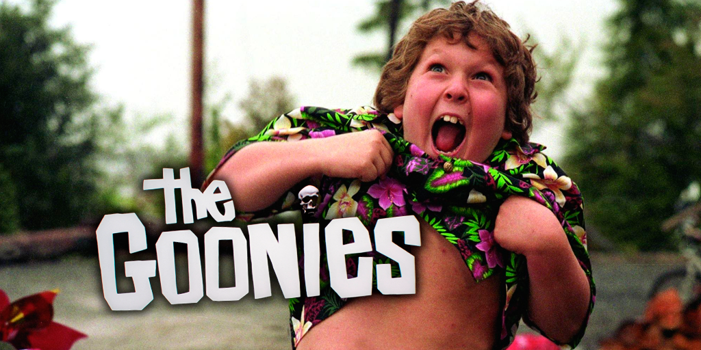
The Goonies logo embodies pure ’80s adventure magic. Its chunky, uneven letters look like they’ve been chiseled straight out of stone, instantly setting the tone for buried treasure and booby traps. There’s even a tiny skull tucked into the “i,” a nod to the pirate gold at the heart of the story. Although no single artist receives sole credit for the design, the marketing team for the film nailed the perfect balance between fun and danger.
What makes the logo so unforgettable is how effortlessly it sparks nostalgia. You can almost hear the sound of waves crashing or the creak of a pirate ship when you see it. Whether printed on a faded ’80s T-shirt, glowing on a movie poster, or stenciled onto fan-made treasure maps, the logo captures the same sense of curiosity and mischief that has made The Goonies a cult classic for generations. It’s not just a title; it’s an open invitation to embark on one more wild adventure.
9. The Mighty Ducks logo

The Mighty Ducks logo is one of those designs that evokes nostalgia. Created for the 1992 Disney sports comedy of the same name, the logo features a hockey mask shaped like a duck’s bill and crossed hockey sticks in bold, energetic colors. Disney’s in-house creative team designed the logo to work both on-screen and for the real-life NHL team inspired by the movie. Playful and instantly recognizable, it manages to say “sports,” “fun,” and “team spirit” all at once.
This logo is especially memorable because it escaped the screen and became a cultural icon. In the blink of an eye, it became the streetwear brand creation of the early ’90s. Kids wore it proudly on jerseys, backpacks, and caps, whether or not they could skate. It blurred the line between movie branding and sports branding in a way that few logos ever have. Even today, decades later, the duck-bill mask shows up in retro merchandise, fan art, and throwback NHL nights.
10. Jaws logo
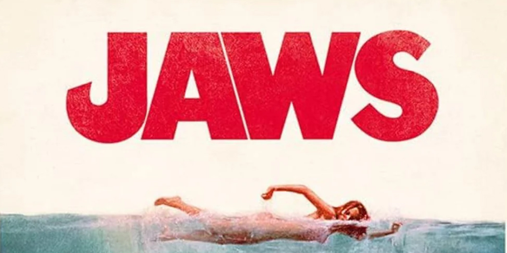
The Jaws logo is a perfect example of how typography alone can make your pulse race. Designed by artist Roger Kastel for the poster of the 1975 film, the bold, blood-red letters are heavy and blocky—and impossible to miss, just like the great white shark lurking beneath them. The tightly stacked type creates a looming, claustrophobic feeling, as if the title itself is bearing down on you. When paired with the unforgettable image of the shark rising toward an unsuspecting swimmer, the logo became one of the most famous and imitated movie graphics of all time.
What’s remarkable is how well the logo works even without the shark image. Put those chunky red letters on a T-shirt, and everyone instantly knows you’re talking about Spielberg’s summer blockbuster that changed cinema forever. The design is simple, aggressive, and drips with menace—it’s been haunting beachgoers for nearly fifty years. Like the movie, the logo doesn’t waste time on subtlety. It goes straight for the jugular.
