

Blue is the color of trust, loyalty, and honesty. So it’s no surprise that great branding designers know how to harness its psychological power. Blue is calm and steady, avoids pressure and stress, and prefers to operate in its own way. It also conveys reliability and responsibility. Many creative agencies strategically use blue for these very reasons. Countless companies have chosen blue as their corporate color because it inspires trust. Every company wants to communicate truth, order, and honesty to its audience.
Blue is more popular with adult audiences. It is associated with maturity
In a color marketing context, blue inspires higher ideals and wisdom. However, keep in mind that it can also be seen as conservative and predictable. Think twice before choosing it if your brand aims to appear revolutionary or cutting-edge. Young people usually prefer more aggressive or striking colors, so they often associate blue with maturity and the adult market. Blue is rarely a risky choice for branding.
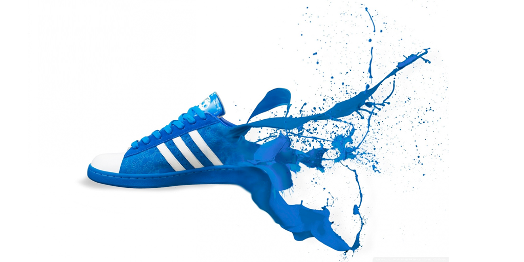
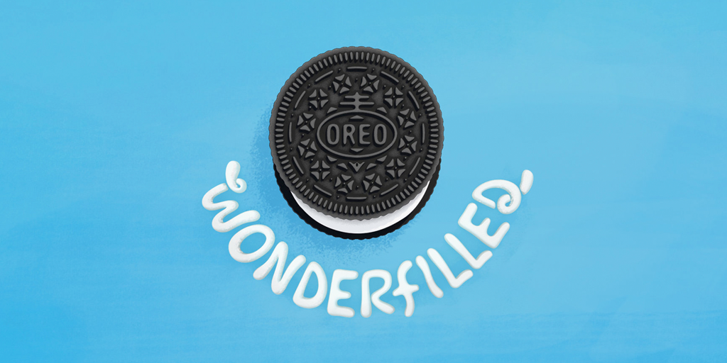
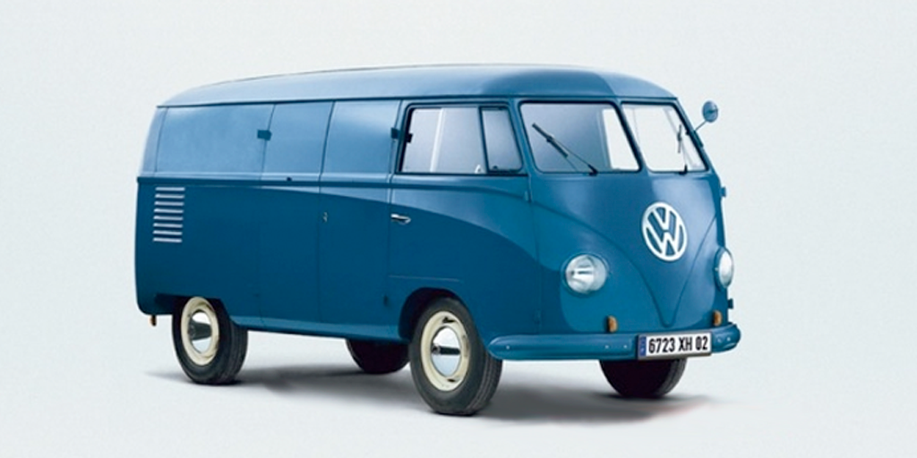
Design agencies know that it is highly versatile and suitable for nearly every industry. It is as great for a social media platform as it is for a healthcare website and brand identity. Blue appears in brand identities across sectors, including automotive, luxury fashion, technology, law, and medicine. While the range is vast, the core message of trust and honesty remains consistent.
It’s one of the best colors for promoting calm and reducing stress
Another key quality of this versatile color is the sense of peace and relaxation it brings to work environments. Psychologically, blue eases tension and fear. As a cool tone, blue creates a sense of spaciousness. Because it promotes calm and serenity, blue is one of the best choices for reducing stress and creating a sense of order.
In addition to its calming effects, the color blue is linked to improved focus and productivity. Studies in color psychology suggest that blue tones help people concentrate for longer periods without feeling mentally fatigued. This makes blue especially useful in offices, creative studios, and other settings where clear thinking and sustained attention are important. Blue fosters a balanced mental state, soothing the mind and supporting better decision-making and problem-solving.
It works well in the corporate world by adding strength and unity
In conclusion, blue is one of the most appropriate and safest color choices. It represents loyalty, trust, and dependability, making it ideal for building customer loyalty. However, experienced graphic designers know that blue is not the best choice if the goal is to dramatically stand out. Blue signals reliability and confidence, aligning more with one-on-one communication than mass messaging. Blue thrives in the corporate world, bringing strength and unity to traditional sectors such as banking, insurance, law, and finance.
That said, blue’s versatility allows it to pair effectively with other colors to create contrast or highlight key elements. By combining blue with brighter or warmer tones, designers can retain its sense of trust and professionalism while still drawing attention where needed. This balance makes blue not only a safe choice but also a strategic one, capable of supporting both subtlety and impact depending on the brand’s goals.