
The world of brand identity design is a complex world. Sometimes you think you got the perfect logo design but people don’t like it, and sometimes you design a perfect rubish while drinking a bottle of bourbon in a bar and everybody love it. I really don’t know what NASA’s corporate logo designers were drinkig or smoking when they got the inspiration. What I only know is that they began this good story, and I’m grateful for that.
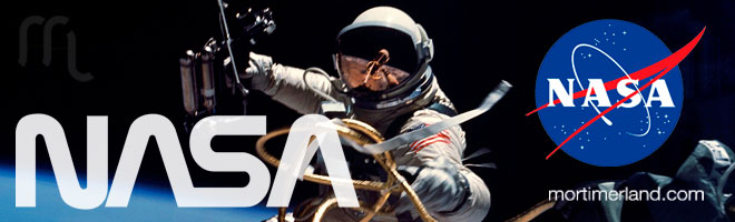
In 1959 NASA decided to modernize their old boring circle. The result was the most famous nasa logo: “the meatball”
Once upon a time there was a space agency whithout a logo, they only had four boring letters on a rocket. But they were such an important agency and it deserver an important logo. So they decided to create the classic agency logo made from a circle with letters around it. But NASA’s relevance raised very quick and they realized that they need a modern brand to identify their agency. In 1959 they hired a brand identity designer to modernize this old boring circle and the result was the most famous NASA’s logo. It was fine for the 60s, and became a symbol of the space race.
Nevertheless, there’s no logo in the world that everybody love. And there’re only a few that don’t have a nikname. NASA’s logo wasn’t an exception. So NASA’s astronauts began calling it “the meatball”. I must confess I really love this cruel nikname.
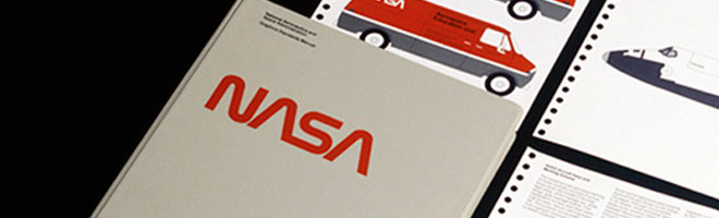
It wasn’t until 1976 that NASA decided to modernize their logo. The new one was called “the worm”
It wasn’t until 1976 that NASA decided to modernize their image according to the new trends. The golden age of space race had gone by, therefore they needed a boost in their public image. A New York branding design company called Danne & Blackburn was chosen to carry out this hard task. NASA’s logo is a worldwide known icon, and design a new one should be a heavy burden. I, myself, think that they did a good job: A modern, visual brand identity design spelling out NASA in thick, curvy letters. With “N” and “S” symbolyzing tubing and crossbar-less and A’s evoking rocket nosecones. As your can imagine, this one had also its own nickname: “the worm”.
The worm was perceived as a cursed symbol by NASA’s professionals
Logos destiny is always a mistery that has nothing to do with brand identity design. There’re a host of factors that determine the succes or the fail of a logo: Trends, circustances, professionals, products… and, in this case disasters. Who knows why people will love or hate a logo before using it? In this case the disaster of the Challenger began the black legend around the worm and some of the NASA’s astronauts put the blame on it. The worm was perceived as a cursed symbol by NASA’s professionals and it could only mean the death of the logo. In 1992 the meatball come back to keep in the agency until today.