

Logos are meant to be a brand’s proud little badge, the thing that makes you say, “Yep, I know exactly who that is!” But every now and then, instead of sleek and iconic, a company ends up with a logo that looks like it was slapped together in five minutes using Microsoft Paint during a power outage. These disasters live on as legends in the design world—proof that even big brands with big budgets can spectacularly miss the mark and end up in the hall of fame for the worst logos ever.
What makes bad logos so entertaining is that they’re not only ugly; they’re also often hilariously confusing. A family-friendly company ends up with a logo that looks anything but family-friendly. Or, a global brand spends millions only to end up with something that looks like a toddler’s doodle. They make you tilt your head, squint, and ask, “Wait…was this a prank?” So grab your popcorn (and maybe a strong drink), because we’re taking a look at some of the worst, weirdest, and most wonderfully terrible logo fails in history.
Famous Logo Fails That Made History

Some logos are unforgettable because they’re timeless works of art. Others are unforgettable for quite different reasons. They make you want to sit the designer down and ask, “Are you okay?” For God’s sake, even made-up brands in movies that are supposed to be funny don’t come close to these masterpieces. These disasters live rent-free in our heads, not because they’re good, but because they’re gloriously, hilariously bad.
Take the London 2012 Olympics logo, for example—a neon jigsaw puzzle that looked like someone sneezed on a pile of Legos. Then there’s the Gap rebrand, which ditched its iconic blue box for something so boring that it was canceled faster than a bad Netflix show. And don’t even get me started on Pepsi’s 2008 logo, which supposedly cost millions but ended up looking like a chubby smiley face that had one too many sodas. Tropicana’s redesign? It was less “fresh orange juice” and more “mystery liquid in a generic white carton,” which explains why sales plummeted faster than you can say “Vitamin C.”
And it gets juicier. The old eBay logo had letters bouncing around as if they had been on a sugar high—fun for a garage sale flyer but not for a global brand. Then there’s Hershey’s 2014 redesign, one of the worst logos ever. It tried to be sleek but instead gave us a chocolate poop emoji. Sweet! Airbnb’s logo, the “Bélo,” was meant to symbolize belonging. However, the internet decided it symbolized other things that we probably shouldn’t draw here. And let’s not forget Microsoft’s Windows 2012 logo, which was literally just a window. Groundbreaking.
Cash rules everything around me… Get the logo. Dollar dollar bill, y’all
Now, let’s bring the public sector into the ring because, yes, government logo design can be cringe, too. The New South Wales government famously spent $160,000 on a redesigned Waratah emblem, only to be criticized for spending so much on branding. The outcome looked more like a “lotus impostor” than the “flower of the people,” prompting a crowdsourcing contest for better options, according to SmartCompany. Then came the “Orwellian” directive asking major institutions, such as the Sydney Opera House, Taronga Zoo, and the Art Gallery of New South Wales, to abandon their distinctive brands in favor of the bland Waratah stamp of conformity, The BragCAMD. In a move that people called “tone-deaf,” the NSW government added a rainbow Waratah for Mardi Gras. This earned the government criticism for prioritizing “rainbow logo nonsense” over bushfire recovery, according to one politician.
When Branding Names Go Bananas
If you thought bad logos were entertaining, just wait until you meet the brand names that somehow made it past meetings, focus groups, and common sense. The purpose of naming a product is to establish a connection and provide clarity with a touch of creativity. But when things go wrong, it’s not just awkward—it’s comedy gold.
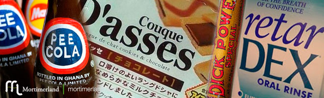
Take Pee Cola from Ghana, for example. Yes, it’s a real soda. And, yes, people outside of Ghana giggle like 12-year-olds when they see it. Then there’s Couque D’Asses, a cookie brand that sounds like it was designed by a French prankster. Next is Dick Power, supposedly a legitimate energy company, but it sounds more like a superhero in an R-rated parody. If you’re looking to freshen up after all that, try Retar Dex, an oral rinse with an unfortunate name. Why not try Retar Dex, the poorly named mouthwash that clearly skipped a round of translation testing?
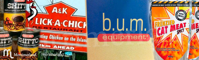
Food branding isn’t exempt, either. Consider Shitto, a traditional Ghanaian sauce made from spiced peppers, whose name makes every English speaker do a double take. Then there’s Lick A Chick, a fried chicken restaurant whose name probably wasn’t intended to sound like an inappropriate dare. And who could forget Bum Equipment, a clothing brand that makes you wonder if they hired middle schoolers for their marketing team? Trust me, this hall of shame is long. It ranges from Japan’s Calpis Water, which doesn’t sound appetizing, to Finland’s Pocari Sweat. These examples prove that international branding can be a minefield of accidental comedy.
Sometimes the worst logos ever are just a part of the worst naming ever
Most of these disasters aren’t because the brands were clueless; they just didn’t think globally. What sounds normal in one language can sound strange—or gross—in another. A little market research and cross-cultural testing could have prevented a lot of embarrassment and internet memes.
At the end of the day, the world of logos and branding is full of chaos, confusion, and occasional comedy gold. For every iconic swoosh or golden arch, there’s a London 2012 logo that looks like someone sneezed on Legos, a Hershey redesign that screams poop emoji, or a soda called Pee Cola that makes you question every life choice. Then there are the naming disasters—Couque D’Asses, Lick A Chick, Retar Dex, and BUM Equipment—proof that ignoring language, culture, and research can produce pure internet-meme material. These failures remind us that branding isn’t just about looking cool; it’s about thinking, testing, and maybe asking a few sober humans for input before hitting “publish.” Yet, as much as we cringe, giggle, and shake our heads, the worst logos and names live on forever, keeping the internet entertained and proving that sometimes spectacular failure is just as memorable as perfect design.