
Knowing when your logo needs a rebrand is crucial for maintaining a relevant and memorable brand. A logo is the visual representation of your company’s values, personality, and promise. When your logo starts to feel outdated, inconsistent, or disconnected from your audience, it can silently undermine your brand’s credibility and impact. Recognizing the signs early allows you to take action before your visual identity starts holding you back.
Rebranding a logo involves more than just changing colors, fonts, or shapes; it’s a strategic process that ensures your visual identity evolves with your business goals, market trends, and audience expectations. A successful redesign strengthens brand recognition, reinforces your message, and positions your company more effectively against competitors. It clarifies your story, makes your brand feel fresh and modern, and helps you connect with existing and new customers on a deeper level. Examining your current logo against these key indicators allows you to make informed decisions that protect your brand’s reputation and ensure its continued impact.

1. Your designer might nail the logo but miss the market
Research is the backbone of any successful brand identity strategy. Branding is more than just creating a visually appealing logo; it’s a full-scale marketing battle. Before making any changes to your brand, you must thoroughly understand your company, its values, and the market environment. Even the most talented graphic designers can create stunning visuals, but without understanding your business’s essence and goals, their work may fail to make a meaningful impact.
For instance, a contracting firm investing in its construction brand identity creation can’t rely solely on strong visuals. They need a design that reflects reliability, expertise, and professionalism while standing out in a competitive market. Through thorough research on client expectations, competitor branding, and industry trends, the company can ensure its logo, colors, and messaging genuinely resonate with commercial clients and homeowners alike, transforming a basic visual identity into a potent marketing tool.
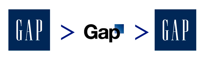
2. The more complex the logo, the better, right? Tell me how that went

A complex brand identity increases the risk of confusing your audience. Overloaded logos, excessive colors, and cluttered messaging can make your brand forgettable—or worse, frustrating. The most memorable brands communicate clearly and instantly without making people work to understand them.
Simplicity doesn’t mean boring; it means thoughtful restraint. By focusing on a few key elements, brands can establish a striking and memorable visual identity. Consider iconic logos like Nike’s or FedEx’s: minimal shapes, limited colors, and clear typography make them instantly recognizable in any medium. A streamlined design ensures your audience can quickly absorb your message, building familiarity and trust with every interaction.
So, how did it go? Take a step back and evaluate your design from an outsider’s perspective. Did people immediately grasp your brand’s personality and promise, or did they have to pause and think? Testing your brand identity with real users—or even colleagues who are unfamiliar with the project—can reveal whether your “brilliantly complex” ideas are landing or getting lost in translation. A little clarity goes a long way in making your brand memorable.
3. Someone is trying to turn your logo into a never-ending story

Never forget this simple concept: people are people, and data is data. Designing a logo isn’t just about arranging every element from a briefing document or following a checklist. It’s about understanding human behavior and emotions is key to grasping how people perceive visual cues, such as the choice of color for your logo. Some designers get caught up in trying to make every idea literally visible, translating concepts word-for-word into graphics. While technically accurate, this approach often misses the deeper purpose of a logo: to connect with real human feelings, communicate a brand’s personality, and leave a lasting impression that goes beyond aesthetics.
For example, if a designer interprets a brief too literally—like creating a “smiling teenage ninja rapper orange” for a dynamic, youthful juice brand—the result may be visually impressive but emotionally disconnected. A strong logo resonates with people, reflecting values and personality in a way that feels natural and memorable.
Oops! Someone forgot to consider the format, platform, and use of the logo
One of the most common mistakes in designing a brand identity is failing to consider where and how the logo will be used. A logo that looks great on a desktop screen may be illegible on a small mobile device, appear faded when printed on merchandise, or lose its impact when converted to black and white. Each platform, including social media, websites, packaging, and signage, has its own requirements, so a logo must perform well across all of them to be considered versatile.
Failing to consider format and usage can undermine brand consistency. If your logo looks different on various materials, it can confuse your audience, weakening recognition and trust. Leading brand design agencies carefully test their designs in multiple contexts to ensure that the logo remains clear, legible, and visually striking wherever it’s displayed.
The Pepsi logo is a great example. It has undergone several redesigns over the decades. When modernizing the logo, designers had to ensure that it would work on everything from tiny soda cans to large billboards and digital platforms. Through careful testing of the logo’s color balance, proportions, and readability in various formats, Pepsi was able to maintain its iconic brand identity while giving it a contemporary, fresh feel. This approach preserved brand recognition and consistency, demonstrating that even the most recognizable logos can benefit from thoughtful redesigns.

5. Your designer went too far with his ideas and now your logo needs a rebrand
Sometimes, your brand designer may get carried away and want to explore uncharted territory. They might experiment with bold shapes, wild colors, or unconventional layouts, thinking that it will make your logo stand out. While creativity is important, venturing too far from your brand’s essence can confuse your audience and dilute your message. A logo should reflect your identity, not just showcase a designer’s imagination.
Venturing too far from your established visual identity can also create inconsistency across your brand. If your logo, typography, or color palette strays too far from what your audience knows, customers may have difficulty recognizing your brand across platforms. The more you drift into unknown territory, the harder it becomes to build trust and a cohesive image—especially in competitive or luxury markets where every detail matters.
This is where rebranding becomes essential. A strategic company rebrand allows you to refresh your logo, refine your visual identity, and realign your brand with evolving goals, values, and audience expectations. Ultimately, rebranding is more than just updating a logo; it’s about evolving your company’s identity to reflect who you are today and where you want to go tomorrow. Taking the time to assess your brand and refine your visuals to align with your values ensures that every touchpoint resonates with your audience. A well-executed rebrand can revitalize your company’s image, attract new customers, and reinforce loyalty. This proves that staying relevant and true to your brand is one of the smartest investments you can make.