
Pink steals the spotlight in perfume design, capturing attention with its playful charm and chic elegance. From delicate pastels to bold fuchsias, pink adds personality, energy, and a touch of whimsy, making every fragrance instantly memorable. Pink branding can be soft and romantic or bold and confident, adapting to the story of the scent. Pink draws the eye, sparks curiosity, and entices people to experience the fragrance before they even lift the cap.
In the world of perfume marketing, pink is not just a color; it’s the heart and soul of a brand’s personality. The beauty of pink branding is its versatility. It evokes emotion, builds personality, and makes a perfume brand feel approachable yet luxurious. Whether it’s a delicate scent for everyday wear or a bold fragrance that makes a statement, the right shade of pink can set the tone before anyone takes a whiff. In the world of perfume branding and packaging, where first impressions are everything, pink is your secret weapon for charm, fun, and unforgettable style.
Pink branding is perfecto to express femininity, love, warmth and sexuality
Pink takes the spotlight in branding, stealing attention with its playful charm and chic elegance. From soft pastels to bold fuchsias, it adds personality, energy, and a touch of whimsy, making any brand instantly memorable. Whether it’s a youthful, fun startup or a sophisticated, luxurious company, pink has the power to convey confidence, creativity, and emotion all at once. It’s a color that speaks before words do, giving brands a distinctive personality that resonates with audiences.
But Barbie’s color isn’t just for perfumes or fashion; it can also make a bold statement in luxury brand identity across industries. From tech startups using vibrant magenta to stand out in crowded markets to boutique hotels and lifestyle brands using blush tones to add a touch of sophistication with a playful edge, pink commands attention. Even in real estate branding, some high-end developers and property brands use pink in their logos, marketing materials, signage, and digital campaigns to signal creativity, modernity, and a distinctive personality that defies traditional luxury color schemes. In a world dominated by black, gold, and navy, pink enables brands to be bold, memorable, and unmistakably stylish.
Consider the following common digital branding scenario: creating a website for a high-end real estate company. By incorporating subtle shades of pink into the design, you can add warmth and sophistication, balancing luxury with approachability. This luxury branding experiment wourl probably end with a modern, welcoming, and memorable site, demonstrating how the strategic use of color can elevate a brand’s entire digital presence.
Ultimately, pink is about more than just aesthetics—it’s about creating an emotional connection. Research has taught us a great deal about how colors work in logos and brands. For example, we know that shades of pink can communicate playfulness, confidence, and charm, and make your audience feel seen and inspired. When used strategically, pink elevates a brand from ordinary to unforgettable, giving it personality, heart, and an edge that keeps people coming back.
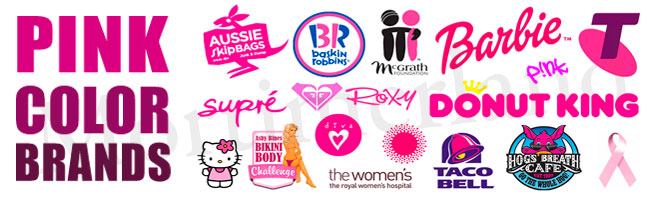
In the corporate world, pink can also be a risky choice
In matter of branding strategy, pink is one of the riskiest colors a brand can choose—and that’s exactly what makes it so powerful. Where blues, grays, and blacks often feel predictable and safe, pink immediately disrupts expectations. It carries an energy that can soften sharp corporate edges or inject bold vibrancy into industries that thrive on trust and seriousness. This makes pink both dangerous and magnetic: a color that can either redefine how a company is perceived or leave it struggling against biases about its “seriousness.”
When used with intention, pink delivers extraordinary results. It has the ability to convey confidence, modernity, and approachability all at once. In industries where consumers crave both clarity and connection—like technology, real estate, or even at finance—a touch of pink can transform a brand from cold and distant into relatable and human. Soft rose tones can feel refined and trustworthy, while brighter, more saturated shades can express daring creativity. When balanced thoughtfully with neutral palettes, pink creates a visual language that communicates professionalism without losing warmth.
But pink is not forgiving. Used without care, it can quickly backfire—making a brand look unserious, gimmicky, or even out of touch with its audience. This is where strategy matters most: color is never just decoration; it’s communication. In the end, pink represents the very essence of branding itself—the ability to stir emotion, challenge convention, and carve a place in people’s memory. Whether bold or subtle, playful or refined, pink reminds us that the strongest brands are those that dare to be human, to take risks, and to connect on a deeper level. That’s why, beyond gender stereotypes or fleeting trends, pink has earned its place as one of the most versatile and emotionally resonant tools in modern branding.