
The colors used in brands and logos send clear signals that we can accurately interpret. Brand identity designers understand how colors impact people’s minds and know how to use them as powerful marketing tools. The power of color in logo design is easy to underestimate because primitive instincts are largely unconscious. Yet, we buy a box of cornflakes or a cold drink every day for unconscious reasons.
Colors do more than catch the eye; they influence emotions, perceptions, and even behavior. A carefully chosen color palette can make a brand appear trustworthy, exciting, approachable, or luxurious without consumers realizing it. Savvy designers use these psychological color cues to create logos and marketing materials that resonate with audiences on a subconscious level, influencing their choices and building stronger connections.
Colors do more than make things look good; they make brands unforgettable. Using a single hue consistently can skyrocket brand recognition and turn a logo into an icon. Consider tech giants in blue, food and entertainment brands in vibrant orange, and eco-conscious companies in green. Each color choice tells a story without saying a word. From packaging to web design to advertising, color weaves a brand’s identity together. Next, we’ll explore how every shade plays its part and why some colors work like magic across industries.

Using the red color in logo design reflects energy and passion
Red brands express strength, energy, stimulation, and passion. Red is the king of brand identity design colors. This is because of its ability to attract our attention first. Red has a physical effect; it stimulates us and raises our pulse rate, creating the impression that time is passing faster than it is. Red is stimulating, lively, and very friendly. However, it can also be perceived as demanding and aggressive.
This color is great because it’s eye-catching and emotional, making it versatile. For example, you could use it to add a creative twist to a jewelry showroom or inspire fashion packaging. You could also use it to design a beauty logo or website in the same evocative style. The key is to make it coherent with your brand’s identity.
Red is not only attention-grabbing but also emotionally powerful. It conveys energy, passion, and excitement, which can help a brand feel bold and dynamic. When used thoughtfully in a logo or website, red can create a strong emotional connection with customers, inspiring action and making the brand more memorable.
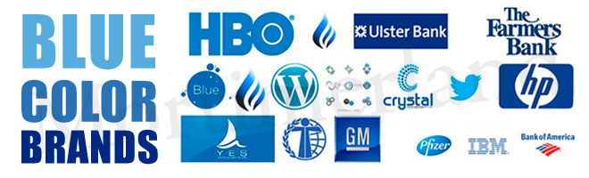
Blue represents calmness and intelligence
Blue brands are associated with intelligence, trust, efficiency, communication, and calmness. Brand identity designers know that blue is the color of the mind and is essentially soothing. It affects us mentally rather than physically, unlike red. Strong blues stimulate clear thought, while lighter, soft blues calm the mind and aid concentration. Consequently, blue is serene and mentally calming. Blue is the color of clear communication.
Because of these qualities, blue is widely used in industries where trust and reliability are key, such as technology, healthcare, and finance. Companies that want to project professionalism and stability often lean on blue to reinforce their credibility. Whether in creative logos or marketing materials, the color helps convey a sense of calm authority, making audiences feel secure and confident in the brand.

Yellow is a striking and friendly color for brand design
Brands that use yellow symbolize confidence, optimism, extroversion, friendliness, and creativity. Psychologically, yellow is one of the most visually striking colors. The right shade of yellow can boost our spirits and self-esteem. It is the color of confidence and optimism.
Yellow has the power to grab attention quickly, which is why it’s a popular choice for call-to-action buttons, signage, and logos that need to stand out. When used thoughtfully, yellow logos can create a sense of warmth and approachability, encouraging engagement and making a brand feel more inviting. Pairing yellow with complementary colors can enhance its impact further, balancing energy with readability and style.
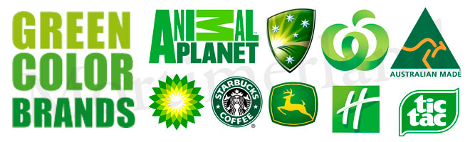
Green logos symbolize harmony
Brands that use the green express intelligence, harmony, refreshment, environmental awareness, equilibrium, and peace. Green color in logo design is restful because it strikes the eye in such a way that no adjustment is required. As the center of the spectrum, green is the color of balance, a concept more important than many people realize. However, green brands can also symbolize stagnation, and when used incorrectly, it can appear too bland.
The versatility of green makes it a favorite in industries ranging from health and wellness to finance and sustainability. Darker shades of green convey stability and wealth, while lighter or brighter shades evoke growth, freshness, and eco-friendliness. Green can be used just right for a sustainable boutique brand identity design or a vegan restaurant; you just need to get the tone right. When used thoughtfully, green promotes a sense of calm and balance, and reinforces a brand’s connection to nature, wellness, and long-term reliability.

Orange is the color of fun brand identities
Brands associated with orange are related to physical comfort, security, sensuality, abundance, and fun. These brands focus our minds on issues of physical comfort, such as food, warmth, and shelter. Obviously, it is a fun color. However, too much orange color in logo design can also mean frivolity and a lack of serious intellectual values.
Orange is an especially good choice for brands that want to appear approachable and energetic. It encourages engagement and evokes warmth and friendliness, making it popular in industries such as food, hospitality, and entertainment. When balanced with neutral tones or deeper shades, orange brands maintain its playful energy while appearing professional and trustworthy.
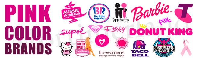
The use of pink color in logo design stimulates attraction
Pink brands symbolize warmth, femininity, love, and sexuality. As a shade of red, pink logo design has a physical effect on us, but it has a soothing rather than stimulating effect. Psychologically, pink is a powerful color. It represents the feminine principle and the survival of the species. It is nurturing and physically soothing. However, too much pink can be physically draining and somewhat emasculating.
Brands that want to convey care, compassion, and approachability often use pink. Lighter shades create a soft, calming atmosphere, while brighter, more vibrant shades communicate energy, creativity, and playfulness. When used thoughtfully in logos, creative packaging design, or marketing materials, pink can emotionally appeal to audiences and reinforce a brand’s nurturing or fun personality.

Black is the color of glamorous brands
Logos with a black color scheme are typically associated with glamour, sophistication, security, efficiency, and substance. This explains why top luxury branding designers are obsessed with the color black. Black also creates protective barriers because it absorbs all the energy directed toward you. Black logos also enshrouds personality. Black color in logo design communicates absolute clarity, with no fine nuances. Luxury brands use black color to convey sophistication and uncompromising excellence, and it pairs particularly well with white. Black creates a perception of weight and seriousness.
Black is a popular choice for high-end branding and advertising because it conveys authority and timeless elegance. When combined with other colors, black can make logos appear bold, modern, or dramatic while maintaining a sense of control and professionalism. Black’s versatility allows it to be used across industries, from fashion and technology to automotive, making it a go-to choice for brands that want to convey strength, confidence, and a lasting impact.